Wednesday, 20 October 2010

Title Block Ideas


One of the last three will be my chosen title block. As you can see all three of them are the same, the only difference is the colour. I will choose which ever colour, that goes best with my magazine.


                                            My title block
The reason I decided to design my title block like that is that it looks messy, so it suites genre of the magazine. However because I couldn’t get the exact colours for my magazine from the research, I decided I will try using as many as I could. However things I had to keep in mind were genre, attractiveness, age group and boldness. Therefore I choose black and white mostly, so it would be sophisticated and bold. The yellow bits in the writing is just something there to make it more interesting for the younger age group 


Tuesday, 19 October 2010

Q Magazine Block Title Analysis

                         Q Magazine Title Block Analysis

Looking at Q magazine you can’t tell what genre of music the magazine is about or what type of audience they are targeting. However the letter ‘Q’ is in an elegant font type which suggests that the magazine is classy.
Meanwhile title block colours are very dominant. White and red  are in contrast of each other therefore it stands out and catches the audience eye.
However the name of the magazine ‘Q’ leaves  us puzzled. It’s not clear what it stands for as it does not state it underneath as does the ‘NME’. However it could be standing for question. As the Q magazine contains a lot of interviews.

NME Music Magazine Title Block Analysis

  NME Music Magazine Title Block Analysis


Just form looking at the ‘NME’ magazine title block you can’t really tell much about what type of music magazine it’s going to be.
The font size used is simple and bold, to attract the eye. The colours in the title are bright, but not irrigative. This tells us nothing about what type of genre the magazine is going to be or what type of audience it is targeting.
However the only thing we can imply about the magazine just from the title block is that it probably comes out more often than once a month. We know this because under the 3 letters (NME) in small writing it defines what NME stands for. The fact that it is a new musical expresses suggest to us that it comes out quite often; otherwise it would not be an express.

Kerrang Title Block Analysis

                 Kerrang Title Block Analysis


From looking at the title block we can tell that ‘Kerrang’ is a rock magazine.  This is portrayed in the name of the magazine as all the edges are rough and has lines cut through the writing. However it’s not only the style of the title block that is suggesting rock genre, it’s the definition of the word/name itself. The magazine's name is onomatopoeic and refers to the sound made when playing a power chord on an electric guitar. Therefore this gives a clue about the targeted audience. Electric guitars as most commonly used for rock music.
Title block colours go well with the genre of the magazine. White and black are bold and tough colours. It’s perfect for rock genre. Colours have stereotypes, so the colour choice is important and has to be based on your targeted audience.

Monday, 18 October 2010

Q Double Page Analysis

      
                   Q Magazine Double Page Analysis

 Lady Gaga is features in this double page spread. Gaga is a pop star there fore this suggests to us that the targeted audience are pop lovers.
The colours used are the same as on the front cover (white, black and red). They are simple and bright yet they don’t irritate your eyes. This gives a sense of maturity through out the magazine. However the red colour is supporting the picture by reflecting Gaga’s sexuality.
On the other hand every topic is highlighted in red, so the person reading wouldn’t get lost between the texts. This makes the article very clear, neat and easy to read. All of the writing is in precise colons. Meanwhile the text style used is very simple and bold. This gives a sense of organisation.
However the buzz line used on the front cover is used in this double spread page as a head line to outline that she is one o ‘the most exiting people in music’.
One page is taken up by a picture and the other is full of writing. However the tone that the magazine creates is informal. When you read the article you get the sense of relaxation and comfort as you would in a casual conversation.
In the image which is shot in a mid shot, Lady Gaga is shoving off her tattoos, this reflects originality and her passion for art. Meanwhile Gaga’s pose and the fact that she is wearing very little shows off her body, this suggests to the audience her confidence.
On the other hand the style of the article matches the style of the front cover. The same colours are used for the article as are for the front page. Therefore the same mood and sense of elegance is kept through out the article.

Thursday, 14 October 2010

Q Magazine Contents Page Analysis

              Q  Magazine Contents Page Analysis


Some images are used to indicate to the audience what is going to be inside the magazine. The shots used for the images are; mid shot, long shot and a close up. This is done so that the audience could clearly see the artists and get a preview of the background as well. However, the larger the picture the bigger the part the artist is going to take in the magazine. Near each picture is a large number, which tells the audience on what page you can read about the artist.  This is done well; it attracts the audience eye straight away.

The pictures on the contents page still mirror the genre of the magazine. In the photographs there are various artists from different genres of music. This refers back to a multi genre magazine.

Meanwhile the same main colours are used for the contents page as are used on the front cover (white, black, red).  Although the magazine looks a bit boring, there are no crazy pictures or bright colours to stand out.

Each main story of the artists on the front cover have a large picture, heading is in bold letters, underlined in red with a big page number next to it. All pictures are in the middle and the writing is on the sides. This is very easy for the reader to access and gives a sense of organisation.

Even though Q magazine has a lot of different sections like; Q mail, Q 50, now, soap box etc...You can tell that they are aiming at the audience who just want to read and look at some pictures. There’s no inserts or posters.

On the first contents page there is a logo of the magazine. This continues to give the magazine consistency and is always promoting the magazine.


Q Magazine Front Page Analysis

                         Q  Magazine Front Page Analysis

Lady Gaga, Jay-Z and Dave Grohl are featured in this magazine. From this we can tell it’s a music magazine. All three of these artists being on the front cover suggest to us that their stories are going to be main in this magazine. This is also supported by the anchorage text. Meanwhile there is also a box in the right hand corner telling us what other artists will be featured in the magazine (the black keys, Plan B....etc).
However the chosen artists on the front cover are there to represent the genre of the magazine. Lady Gaga is a pop singer, Jay-Z is a hip-hop artist and Dave Grohl is a rock artist. This is all indicates that this is a magazine based on more than one genre of style.
The targeted audience are older people in their 20 and onwards, who are sophisticated and interested in the music world.
Direct mode address is used all three artists are looking at the camera directly; this makes it personal and grabs the audience by the eye. Their strait posture suggests confidence, power and their influence over the music industry. The fact that Jay-Z is in front of Lady Gaga and David Grohl indicates his supremacy and high self-respect, as he is one of the most successful hip-hop artists in America suggest  that he will be the most talked about in the magazine.
On the other hand all three artists’ want a different relationship with the audience. Gaga has her hand up to her head almost as saluting us in military style. This tells us that her relationship with the audience is going to be strictly professional. Meanwhile Jay-Z has his hands in his pockets, legs spread wide apart and his head healed high looking down on the audience. This connotes to us that he might have an attitude problem and wants an everyday relationship with the audience. However Dave Grohl has his hair on his face suggesting to us that he is shy.
 ‘The 10 most exiting people in music now’, this quote is at the top of the magazine. Lady Gaga, Jay-Z and Dave Grohl are some of the most famous people in the music world today. Therefore it justifies why these artist where chosen.
Moreover the anchorage text tells the audience a little bit about the artist’s personality or what stage in life they are at. Also the ‘exiting people’ text at the top refers to the three chosen artist on the front cover.
The overall message sent by the ‘Q’ magazine is that the music industry now is more sophisticated but still entertaining.
The words ‘exiting’ and ‘exclusive’ are in different colours from the rest of the texts. This is done to attract the audience.
Meanwhile the title block is on a red background and the letter Q is written in white. Red is an attractive, warm and mature colour. Therefore this makes it very appealing to the audience, and links it back to the targeted older age group.
However there are puffs which represent other bands and artists on the other side of the magazine. Q magazine presents them in boxes or bubbles.


Tuesday, 12 October 2010

Double Page Spread analysis

                             Double Page Spread Analysis

Music band ‘Bring Me The Horizon’ is featured in this article. Bring me the horizon is a rock band, this suggest to us that this is a rock magazine therefore the targeted audience are people interested in rock music. The band is a modern band so it’s aiming at young to middle age audience.
The style of phrases is used to specify the style of the magazine. Phrases like ‘panic then carry on (we’re fucked anyway) ‘are used so connote the bad ass image. Also things like ‘I was pissed off, upset, angry. I couldn’t enjoy anything’ or ‘to hell and back’. This is all portraying rock style; scruffy, hard core, ill-mannered. This is all what rock is about.
However the colours used are dull and depressing. Mostly black, white, grey and some red are used.
The style of text is simple and easy to read. The paragraphs are separated by space. In addition to that the first letter of every first word in a new paragraph is in a much larger font size than the rest of the paragraph.  This is very useful as it keeps the reader in track, so they don’t lose themselves between the paragraphs. However they also use a lot of quotes and phrased like ‘Your soul needs you’ to catch the readers eyes.
On the other hand the double page spread uses the first page mainly for the picture. However they have the title in block letters ‘to hell and back’, there’s a box of writing at the bottom to tell us a bit about the band. Lastly in the picture on the walls there are posters with phrases; ‘germs spread diseases be afraid of what you can’t see’. Meanwhile the second page layout is a bit different. Still the picture is the main thing, but there is quite a lot of writing as well. The writing as if almost compromises with the picture. It is fit in the free space of the picture almost making a boarder. Therefore most of the space is taken up by the pictures.
The band is presented through the images in a sand and miserable way. They have blood all over them, black circles under their eyes and look hurt, both mentally and physically. However in the pictures there is an old woman, a child with a mother and a young woman, while the band is facing a difficult time in the pictures.  This is indicating a close family relationship.
The style of the article matches the style of the front cover. The same band is used, their same outfit is used and mostly black and white is used on the front cover and in the article. Also the text font is similar, so it makes the front cover and the article look alike.
 The article does not demand for any prior knowledge. I have never heard of the band and I had no trouble understanding what the article was about. It’s very informative, I found out a lot about the band.

The tone the magazine is using is as if I was a member of a       crowd. It’s polite, revealing and expects me to be interested in the band or all bands.

Thursday, 7 October 2010

Kerrang Music Magazine Contents Page Analysis

Kerrang Contents Page Analysis

Kerrangs’s magazine uses a lot of photographs for the contents page; this is because pictures catch the eye quicker than the writing. A lot of the pictures are used to illustrate some of the things that are going to be inside the magazine. However at the top, taking up half of the space there is the biggest picture of Ozzy Osbourne. This indicates to us that Ozzy’s story is going to be one of the main stories in the magazine.  The bigger the pictures, the bigger the part the story plays in the magazine.
Meanwhile the pictures are still representing the magazines genre and its targeted audience. A lot of the props used in the pictures associate with rock and bands. Although the contents page is quite boring, the audience are rock fans. They would want something more hard core and exiting.
On the other hand content page supports the style of the front cover. Some dull and bright colours   been used.  They are mostly the same as on the front cover; white, black and red. However they also added yellow to highlight the headings. This can imply a rocky/indie type genre of the magazine.
The information and most of the pictures are in columns this then prevents the page from becoming messy and gives the reader a sense of organisation and therefore is easily accessible and effortless to read.
Kerrang magazine contains a lot of different sections such as: Feedback, news, win, live reviews, features, albums, gig guide, k!Quiz, This shows that the audience their aiming for do not want to sit there and read a magazine full of writing . They prefer more posters, pictures, interviews, new albums and concert dates. The audience want information on bands and who’s performing live.
Meanwhile the magazine logo is in the middle of the page right at the top off all the different sections. The reason for having the magazine title ‘Kerrang’ at the top of all the different sections is because it will continue to give the magazine consistency and it is always promoting the magazine. However it’s not the most dominant as it could be, but you do notice it as it’s written in the biggest font size on the page.
Despite this the magazine is also advertising their other franchise. At the right hand corner there is a box highlighted in red promoting their delivery service. This is attracting new and old buyers to buy their magazine monthly.

Tuesday, 5 October 2010

Results


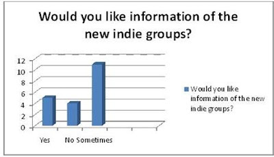
I gave 20 students my questionnaire both male and female. Above you can see the results.
From these results now I can decide what my magazine is going to be based on and what thing I am going to include. As you can see from the results, I didn’t get the exact colour choice so I decided to use as many of the favorites as lonng as they look good.  The colour choice is good because in not just dominant to one gender. My magazine is going to be targeting both male and females. I will include interviews, new indie groups and tour dates. My targeted audience are walling to pay £2-3 a month for the magazine, so i decided to make it right in the middle by charging £2.50 each month.

Monday, 4 October 2010

Kerrange Music Magazine Front Cover Analysis

Kerrang Music Magazine Analysis

As we can instantly see this is a Rock magazine. The genre of the magazines is also supported by its name. The name is onomatopoeic and refers to the sound made when playing a power chord on an electric guitar.

In this issue we see that they mostly have articles about well known bands who have been silent for a while. The  magazine is aimed at those who listen to heavy metal and rock bands. This is a niche magazine as it aims to a distinct segment of the market, in this case the rock genre. However, this magazine also aims to use other bands from different sub-genres of rock such as punk rock (green day) ,alternative rock (muse)and put them on the front cover in order to attract more readers because rock is a very distinct genre.
They are targeting people  probably age 16+. Their main interest should be rock bands.

The central image is indicating to us that the group has been raised from dead. The five members of the group all have very pale faces,dark circles around their eyes and blood smeared all over them. However the blood also indicates the pain and emotional difficulties as the group went through in the pas two years or so. This suggests to us that they want sympathetic relationship with the audience.

As you can see on the front cover there is a rock/metal band called 'Horizon'. The anchorage text supports the central picture and again implies to us that from rock bottom the group rises again. This connotes that the group has had some rough times but still manage to stay together. Meanwhile the over all message given is that the 'Horizon' has been to hell and back.

On the front cover of the Kerrang magazine there a quite a few groups represented. Mostly the magazine presents them by the 'live and loud poster special'. The magazine contains free posters of Green day, Metallica and Muse. The magazine shows off the give away by uploading their pictures in the corner of the front cover.. However the magazine does represent one other group and artist separately.

The design of the title block is damaged; again this is supporting the central image. There are lines cut through the writing this again this could be indicating why there is so much blood on the artists.

On the other hand the puffs suggest to the audience that there will be a lot of information about bands. It only states name of the bands and artists. The magazine expects to get audience who are very interested in rock legends.

Meanwhile there are three font colours ; Black,white and red. I have no problem with the colours because they are bright and attractive but not irritating.

The strategies to attract audience are very simple. They use contrasting colours,different writing fonts and their sizes.